How to design a business website
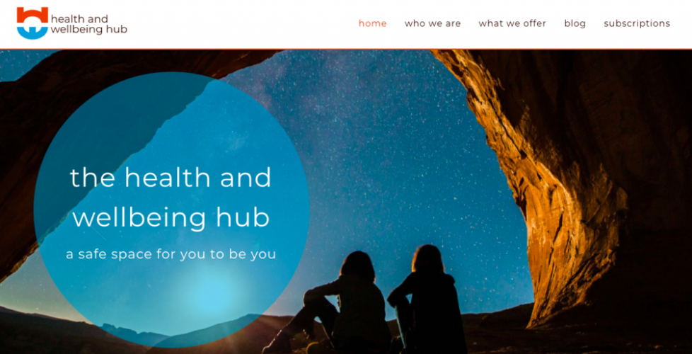
I recently posted on LinkedIn about how to design a business website and the work we’d done for the Health & Wellbeing Hub website https://healthandwellbeinghub.org/ as they launched their new venture.
Then we went on holiday (Cornwall – lush). So a little later than planned, I want to provide some more details. It was a great project, with full and enthusiastic engagement from our clients Simon and Colin every step of the way. Our collaboration with the Hub continues and we look forward to more website developments in the future.
I thought I’d run through the process of how we built the website from concept to launch. I will leave out some of the technical aspects such as the website builder we used (Elementor https://elementor.com/ ) or the challenges we faced trying to get the formatting exactly right. This post is meant to cover some of the more creative processes.
LOGO DEVELOPMENT
We started with the Health & Wellbeing Hub logo. This would provide a steer on the brand guidelines, and Colin and Simon could use it to publicise the Hub on social media prior to the website being launched.
This is the logo we ended up with:
The H and the W are obvious. By altering their shape we were able to utilise the elongated curves to ensure that the two letters mirrored each other. The curves soften the letters and enabled us to create a near-circular, almost connected logo. This motif represents inclusivity – the Hub welcomes everyone.
We also felt it was important to make the H look a little bit like a bridge too. The Hub is exactly that, a bridge between qualified mental health professionals and the community that they want to help and support.
Once the logo had been created, we resized it to make it suitable for the main social media channels such as Twitter, LinkedIn, Facebook and Instagram. Although print seems to be slowly dying as we hurtle through the 21st century, it was still important to make sure the logo was suitable for material such as business cards and letterheads.
CREATING BRAND GUIDELINES
Lucy spent quite a bit of time putting the brand guidelines together. She had to consider:
- What fonts and sizes would the website use
- How to format the H1s, H2s, and other headings
- What would the colour theme be?
Website accessibility standards
Firstly, the website had to be accessible. But what does this mean? Ideally, everyone should be able to use any website on the internet. It shouldn’t matter if they have a condition that affects their capabilities, or what hardware and software they need to use (source: https://www.dreamhost.com/blog/make-your-website-accessible/ ).
If you design a website with accessibility in mind, you are ensuring that as many people as possible can fully utilise it.
Some of the key impairments to take account of are:
- Visual impairment – a partial or total inability to see colour contrasts
- Hearing impairment
- Motor skills or physical disabilities that can impair the ability to make precise movements, e.g moving a mouse
- Photosensitive seizures that can be triggered by flashing lights
- Cognitive disabilities – a wide range of conditions which could include for example dementia and dyslexia
There are many online tools that help you achieve accessibility. Maximising accessibility expands your potential audience – it’s as simple as that. It was with this key foundation stone in mind that we built the website.
Choosing the colour scheme
We wanted bright vibrant colours for the logo that reflected the positive ethos of the Hub. However, the logo colours weren’t suitable for the website pages themselves. So we used slightly darker tones which improved accessibility but kept to the brand guidelines.
For example, the main background colour on the Who We Are page https://healthandwellbeinghub.org/who-we-are/ is a darker version of the sky blue which is used in the logo. And the names of the Hub team are a darker version of the vibrant orange.
Choosing the right font
Lucy is a confirmed nerd about fonts, and proud of it! She loves browsing through fonts and choosing one which she feels best suits a particular project.
We picked a single font for all the text on the website to maintain consistency. Obviously, multiple fonts can work depending on the project, but for the Hub we decided on the one font throughout.
We chose Monserrat because it’s a soft, rounded font that also has a nice, crisp quality to it. An angular or bolder font wouldn’t have been suitable. The visual impression would probably have been rather jarring.
For the same reason – maintaining the softer aesthetic – we didn’t want the font to be a bold, strident black. We picked a shade that wasn’t quite as stark but still complimented the main colour scheme.
Some may feel that choosing to use lower case text for the headings, H1s, H2s, etc is a bold call. But again, we wanted to maintain the overall harmony of the website. The body text is in sentence case though – we’re not total barbarians!
It’s a personal opinion but people often don’t object to seeing lower case text on websites if it’s consistent and feels natural. Lower case text does seem to be on the increase as writers and designers everywhere realise that the old ‘Queen’s English’ rules are there to be broken, in the right circumstances.
THE FIVE PILLARS OF WELLBEING
The Five Pillars of Wellbeing are principles by which an individual can improve their mental and physical health. Based on years of research, they are generally accepted and actively promoted by multiple health & welfare organisations, for example –
- the NHS https://www.nhs.uk/mental-health/self-help/guides-tools-and-activities/five-steps-to-mental-wellbeing/
- and Mind https://www.mind.org.uk/workplace/mental-health-at-work/taking-care-of-yourself/five-ways-to-wellbeing/
The Five Pillars of Wellbeing are:
- Connect with other people
- Be physically active
- Learn new skills
- Give to others
- Take notice
Therefore it was only natural that the Health & Wellbeing Hub wanted to base the support that they offer around these principles https://healthandwellbeinghub.org/what-we-offer/
We created an icon for each of these pillars. Each icon matched the colour palette of the logo and kept the theme of softer curved lines. Obviously, each icon had to represent each pillar, and the connection between the words and the image had to be obvious and easy to understand.
The icons went through several development stages, and much back and forth between us and the Hub team. This was probably the trickiest part of the process. The ‘Connect’ icon in particular went through several iterations.
Connect
Be active
Learn new skills
Give to others
Take notice
THE WEBSITE COPY
Writing the website copy was another truly collaborative effort. Most importantly we had to defer to the Hub team’s expertise. After all, they are all fully trained Mental Health First Aiders https://mhfaengland.org/
We had to strike the delicate balance between being sympathetic, kind and welcoming without being patronising and trite. I think we’ve just about managed it too. You’ll notice that the text is also largely positive. No judgements, no ironic edge, no excessive details on the more negative aspects of mental health.
This is completely intentional. Being trained professionals, Simon, Colin and Richard are used to supporting people with mental health issues and dealing with some of their negative effects. But the Hub community itself is the appropriate place to deal with that. The website is a door to that community and the text reflects the fact that the door is always open, always welcoming.
It’s purely a personal preference, but in this particular instance, I would rather lean slightly towards the text being trite if it means the website is as accessible as possible.
That’s not to say the Hub avoids discussing difficult subjects with honesty and integrity. The team post regularly on the blog page https://healthandwellbeinghub.org/blog/. Posts have already covered addiction and suicide prevention, for example.
Hopefully, this post has proven to be an interesting look at how to design a business website. We certainly found it an educational and very enjoyable process. Incidentally, creating and maintaining the Hub blog page provides an interesting challenge in itself. I’ll explore this in a future blog post of my own.


